The Art Of David Oakes
Freelance Illustrator
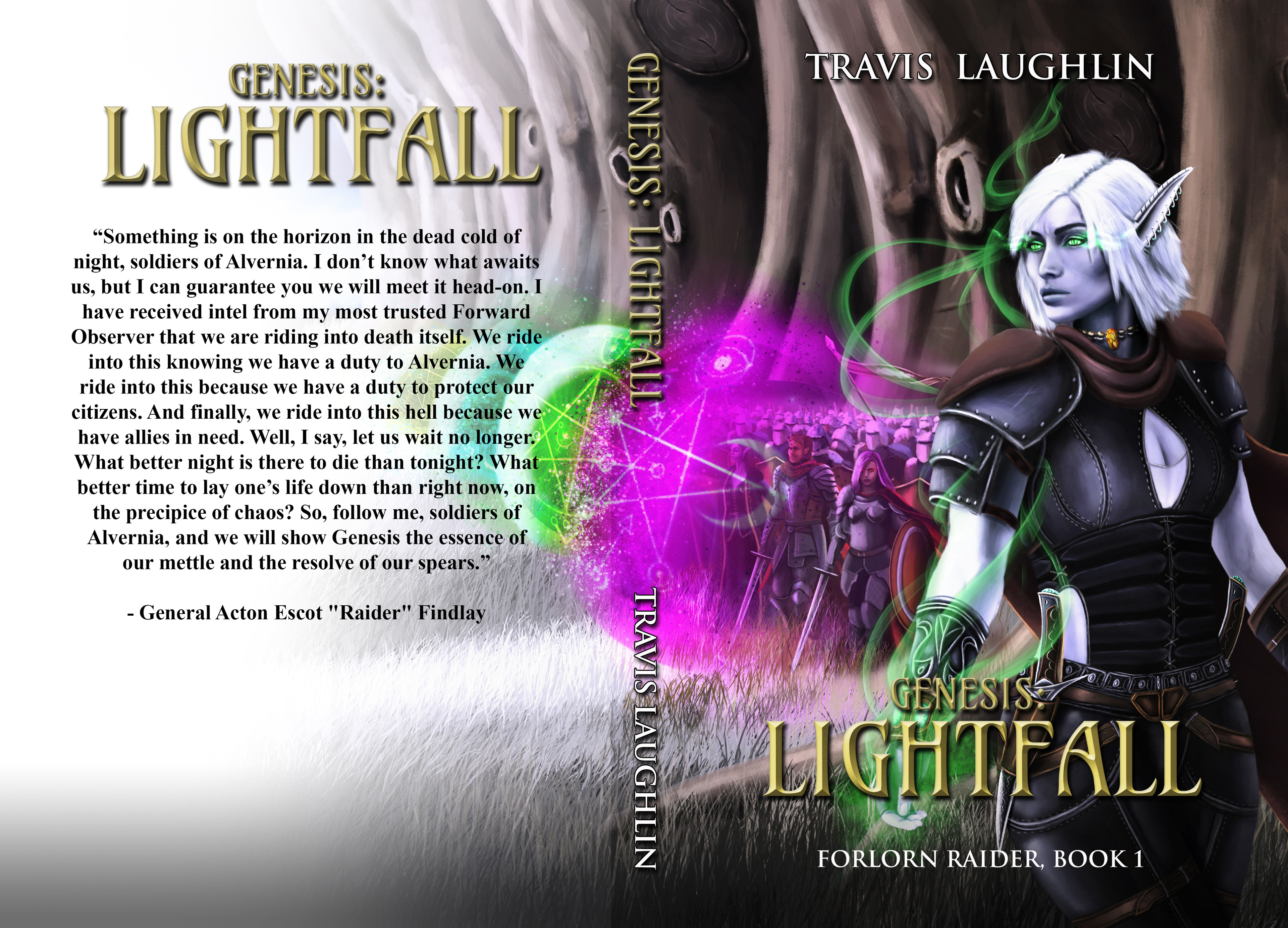
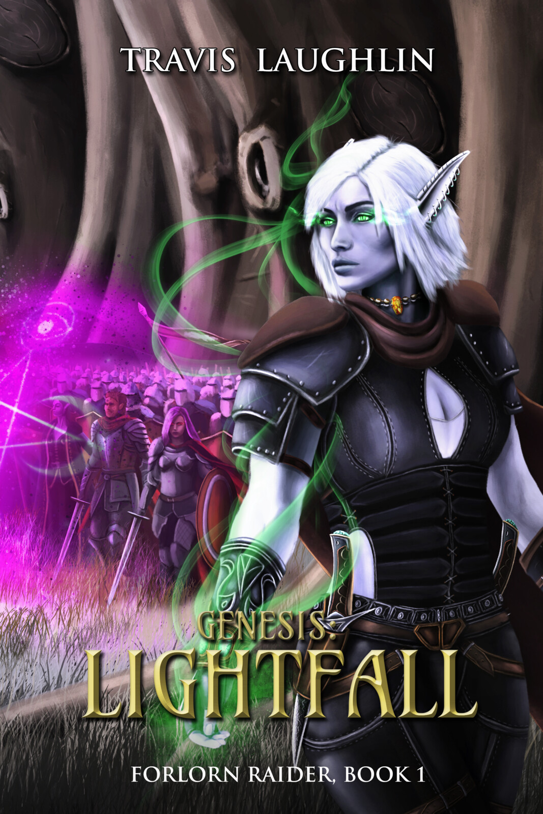
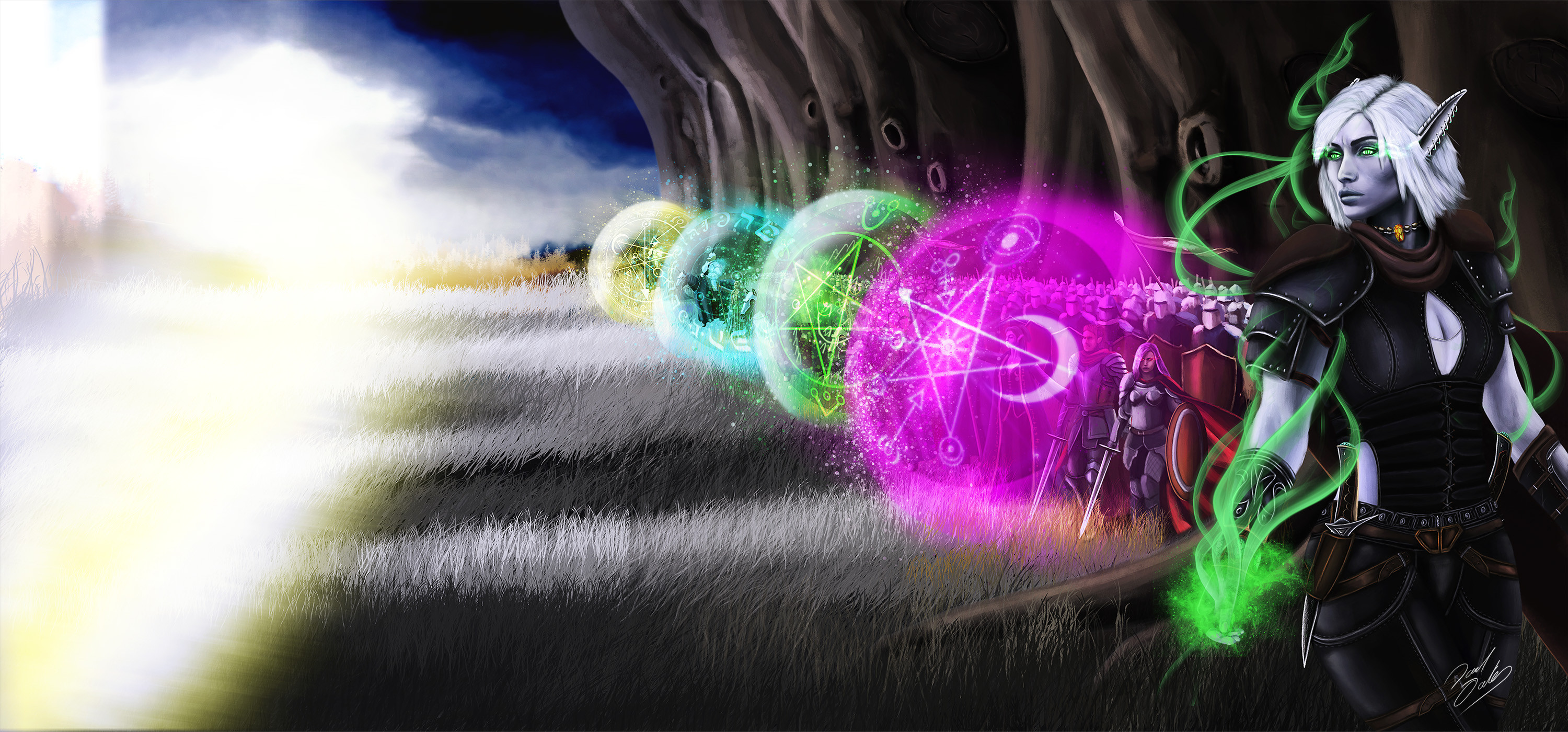
Forlorn Raider Lightfall - Book cover
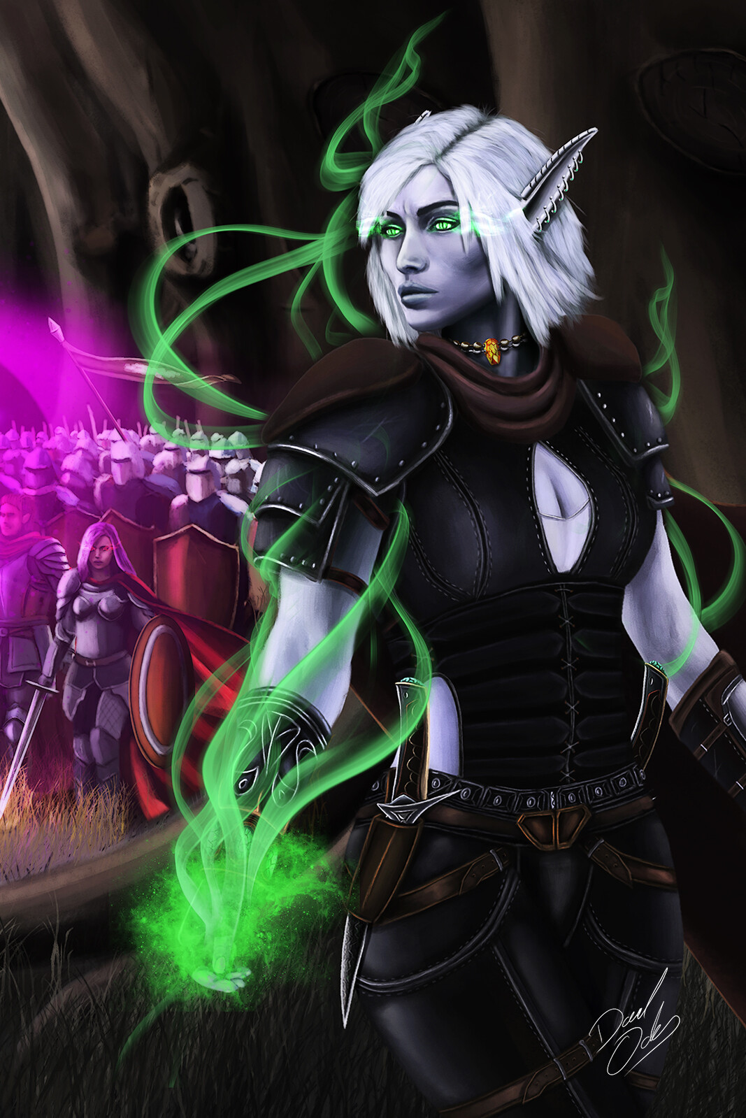
Forlorn Raider Lightfall - Book cover
The author was in the process of re-doing the first story in his series Forlorn Raider and came to me with an idea a re-doing of the cover.
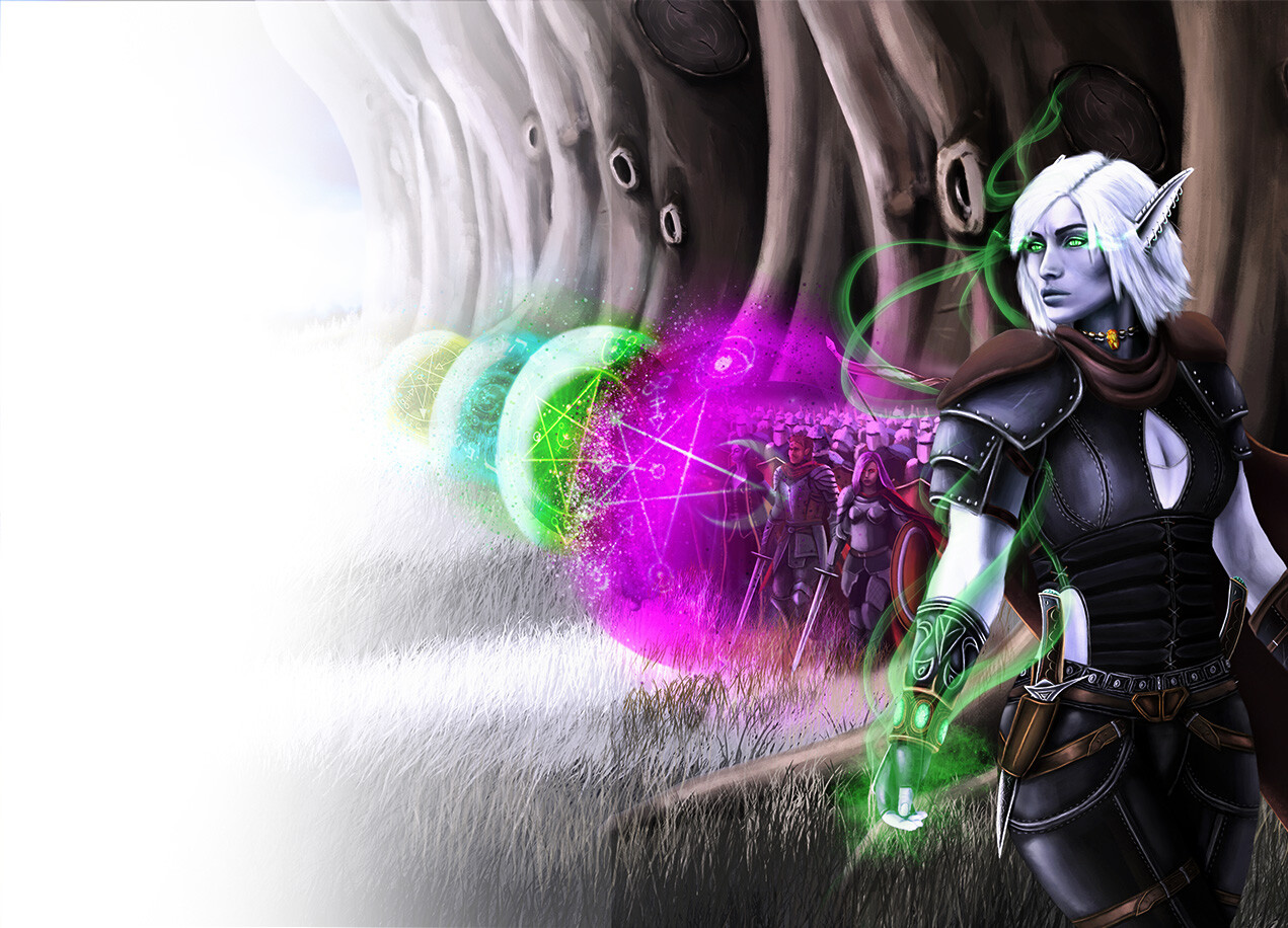
While the original cover was liked it did not have anything related to a "lightfall" in it and he wanted to correct that.
The main idea was that due to the lightfall coming in like a tidal wave the lights were bright and the darks were dark. Creating a pretty big contrast in the scene.
For anyone interested I left the link for the first book: https://shorturl.at/cpsEM
